I'd like to get as much feedback as possible, so please, tell me your favourite picks, tell me which ones you hate, or fresh ideas!
You can leave a note here, or email me at joegilland@shaw.ca with your 'vote'.
I have no problem filling the inside of the book with animation goodies, but designing a cover is really hard. It's what everybody sees, and it should make an impression. I got very mixed reviews on the cover of the first 'Elemental Magic' book, some love it, some hate it. Of course I'll never make everyone happy, but you all matter to me, and I'd love to hear what you think of these. They are just preliminary designs, and I might end up going in a completely different direction, but the size and title and the font is pretty much the way it will look....So, send your thoughts, OK? Thanks!


36 comments:
I like Cover_13 the most. It best conveys what the book is about in a simple and clear way and gives a lesson in the process. Cover_4 would be my 2nd choice.
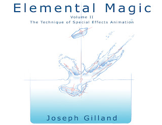
I like #1. Simple and clear. Who doesn't love seeing a pencil drawing.
Firstly thank you for your first book. Just bought it and find it a fantastic resource. I'd say 1 or 13. There are other covers and images i like alot more, but in terms of sticking something on your cover that is going to cause the most people to pick it up, I think they are the obvious choices. As long as the others are still in the book!!
My votes for Cover 1, 10 & 12 in that order. I think that if its a book about classically animated effects it should have one on the cover. And since the last book was white I feel this one should be too. Just my 2 cents.
1st, 3rd and 6th.
1: Depicts both drawing and some technical elements, looks good for that kind of book.
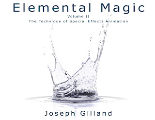
3: nice combination of splash on totally unnatural white back
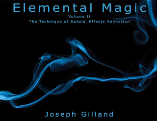
6: who can resist the book with blue smoke on totally black back..?
Just to add: other images contains too many small elements, making them visually complex and harder to understand at first sight.
6 is the best because it is bloack which is a little bit like magic and the smoke is an intriguing special effect. Ithink this pic covers it
I like Cover#3 and #4...clean, clear, fluid and elegant :-D
If I had to pick just one....it would be #3. This was the one that I liked the best. I do have my second, third and fourth, but I will just tell you my first.
Marilyn
Sorry but I don't find any of them to be "in theme" with what the book is about.
They are nice designs don't get me wrong but...
Dear Frncheez,
Are you 100% sure you know what the 'theme' of the book is about? I think if you were, you'd see that these covers are very much in line with the book's content....
the author.....
#1 and #2
Personaly i like number 13 and number 9 and even number 1. I really can't wait for the book. <3
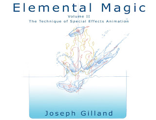
How about #4 with the addition of a human, plant, and animal element. The lightness, movement, and color are fantastic. The liquid alone doesn't convey emotional connection but something that adds narrative possibilities--who's that, what's that, what's about to happen?--would make the book leap off the shelf.
I think #9 & #1 show the art & science of EFX in simple & plain fashion, Plus i think it would be great companion with the first book's look. ..Les
I like #1 and #6.
#1 is my favorite, clear and simple and beautiful.
.. Silvia
i really like how clear #1 reads.
it could also be fun to try something like an explosion just under the surface of the water, something that incorporates more elements together, water splashing, fire exploding, smoke rising, maybe even electrical discharge. just a thought :)
The second one is my choice for staying in line with the first one. Don't get with the wads of smoke, because that was a package design of Softimage-XSI.
#1, and not because you display it first here, but because I think it conveys the technical and handdrawn aspects well. It's interesting to look at and clear. Also would agree on white, so it sits nicely next to the first volume :)
Totally #1. Just looking at it I feel like Ive already learned something.
Best of luck finishing volume 2!
Hi Joseph!
I'll be a stinker and say none of them are there yet. I like #1 perhaps the most... but it doesn't fulfill the marketing message to the point I think it could. This may be a bit irrelevant as anyone who knows you or your first book would know what this one is about too, but I feel it could do more.
P.s. Still listening to your song!
#1 or #13
Thanks for your fantastic books!
I like #4 the best.
I know this is a few months old but I'm giving my opinion anyway, because I like to give opinions :p
I like #1 (my favourite/top choice) - it has a clean and clear drawing that illustrates the books content in the clearest and most appealing way. I like that it has a really organic drawing, as well as some mechanics to it.
second choice: Design 7 is really nice, but I'd like it better if the smoke was blue, like on the black cover. I don't so much like the black cover because your first cover is white. I'm picturing them on my desk together, and I think they would be most appealing if they were matching white.
3rd choice: design #3 the really simple white bg, is appealing, and the splash is exciting. It has a modern style to it.
The reasons I didn't say any of the others was because some of them I think are over complicated, or too busy. They don't read quickly enough.
and there's my opinion :p
- Jayleen
just met you in Moncton at McKenzie college. I know you didn't have a lot of time, but I really appreciate you taking the time to talk to us.
I just finished with Visual Arts (I was the only one there NOT in graphic design today, haha)but I will be taking McKenzie's graphic design course next year so please come back next year when you have some time. lol!! I'd love to listen to you talk some more.
Take care!
Amy
#3 is the one I like the most.
Interesting, we share the same series title. lol I prefer cover # 6. It's very striking.
Brynna Curry
http://brynnacurrybriannaroarkebooks.webs.com
I must absolutely buy the first volume it seems to be wonderful ;__;
Then I will buy the second !
By the way, I prefer the covers 1 & 10.
DESIGN #3 AND DESIGN #6, THESE ARE THE ONES THAT ATTRACT ME IMMEDIATELY TO PICKING IT UP ON A SHELF.
And #7...It would be interesting to know which you chose.
Design #1 or #14 definately work best. You must show some technique with the cover art, and these two show it most clearly.
Design 2 and 15 are my favorites:) The black is reminiscent of the whole film experience...sitting in a dark theater, film, etc. On top of that, it's striking. I also like the 2d incorporated into both of these designs. The fire really grabs your attention. Regardless of your decision, I'll buy it though:) Take care.
I LIKE NUMBER 1
I would rule out photographies.(I would not use 3,4,5,6,7)
A drawing done by hand is impressive.
I vote for a drawing done by hand, to show art and detail of observation (basic concepts of the book).
With intense movement to exalt the beauty (Picture 12, splash loses protagonism).
With few arrows to show movement, but not to confuse the inexperienced viewer (Image 14 is very complicated).
Vote for No. 1. It's simple, elegant, explains the content.
Nobody can be confused with the photo 1.
Also photo 15 (But I prefer white backgorund).
The image that I liked most of the first book was the water at impact with the ground turning into others elements. Maybe you could use that one.
I hope these arguments be useful
=D
trustNjesus.
Convert your images into the pencil photo sketches with different colourful drawing effect. This app contains also kid’s hand-drawn colour draw sketch. Lest say goodbye low-level picture editor tool & use this easy & simple photo to sketch & pencil sketch photo editor tool. pencil sketch
Post a Comment